
OVERVIEW
COMPANY
CORE TEAM

TIMELINE
Apr 2021 - Jan 2022
TOOLS

ROLE
Lead Designer
RESPONSIBILITIES
Product design
Visual design
Interaction design
User research
Comparative analysis
User story mapping
Information architecture
ABOUT BLUE YONDER
Blue Yonder is a leader in intelligent supply chain solutions, helping global brands harness data, AI/ML, and cloud technologies to optimize end-to-end operations. Its Luminate Platform delivers a unified view for proactive planning and decision-making across manufacturing, logistics, and retail. By enabling autonomous, synchronized supply chains, Blue Yonder empowers businesses to drive profitability and elevate customer experiences.
PROBLEM
Developer portals are often built with developers in mind, but not always with accessibility or adoption in focus. This narrow assumption results in a disjointed experience: unclear navigation, inconsistent documentation, and missing context discourage usage across teams. Without clear standards on what to document and how, teams struggle to discover, understand, and confidently adopt available APIs.
APPROACH
The goal was to design an API catalog that not only supports reference documentation integrated with Swagger UI, but also prioritizes intuitive navigation, robust search, and filtering. As Lead Designer, I focused on defining a clear site architecture and mapping user journeys to deliver a seamless, accessible experience for both technical and non-technical users.
IMPACT
CHALLENGE
The biggest challenge was balancing technical depth with usability. While developers needed detailed, Swagger-integrated documentation, other users like product managers, solution architects, and support teams required quick overviews, use cases, and a clear understanding of how APIs fit into the broader ecosystem. Designing for multiple levels of expertise, aligning cross-functional expectations, and retrofitting structure onto legacy content demanded both strategic coordination and scalable design thinking.
PROCESS
To ground the redesign in real-world insights, we conducted a SWOT analysis of competitive developer portals such as Swagger, Stripe, Plaid, and Mercedes-Benz. This helped us understand their strengths and weaknesses, uncover opportunity areas, and identify potential threats.
Strengths
Clear introduction or home page
Quick and intuitive navigation
Grouping APIs by categories or use cases
Comprehensive documentation for each API
Weaknesses
Continuous data flow without clear section breaks causes confusion and overload
Lack of expand/collapse functionality for sections
No easy way to trace back navigation steps
Opportunities
Providing quick-start or ‘how-to’ guides for client libraries
Including lists of common data types and error codes
Suggesting related or similar APIs to users
Enabling copy-and-try-out code snippets
Simplifying content without overwhelming users
Threats
User experience that isn’t intuitive or engaging enough
Poor categorization, search, and filtering capabilities
Technical limitations that hinder functionality


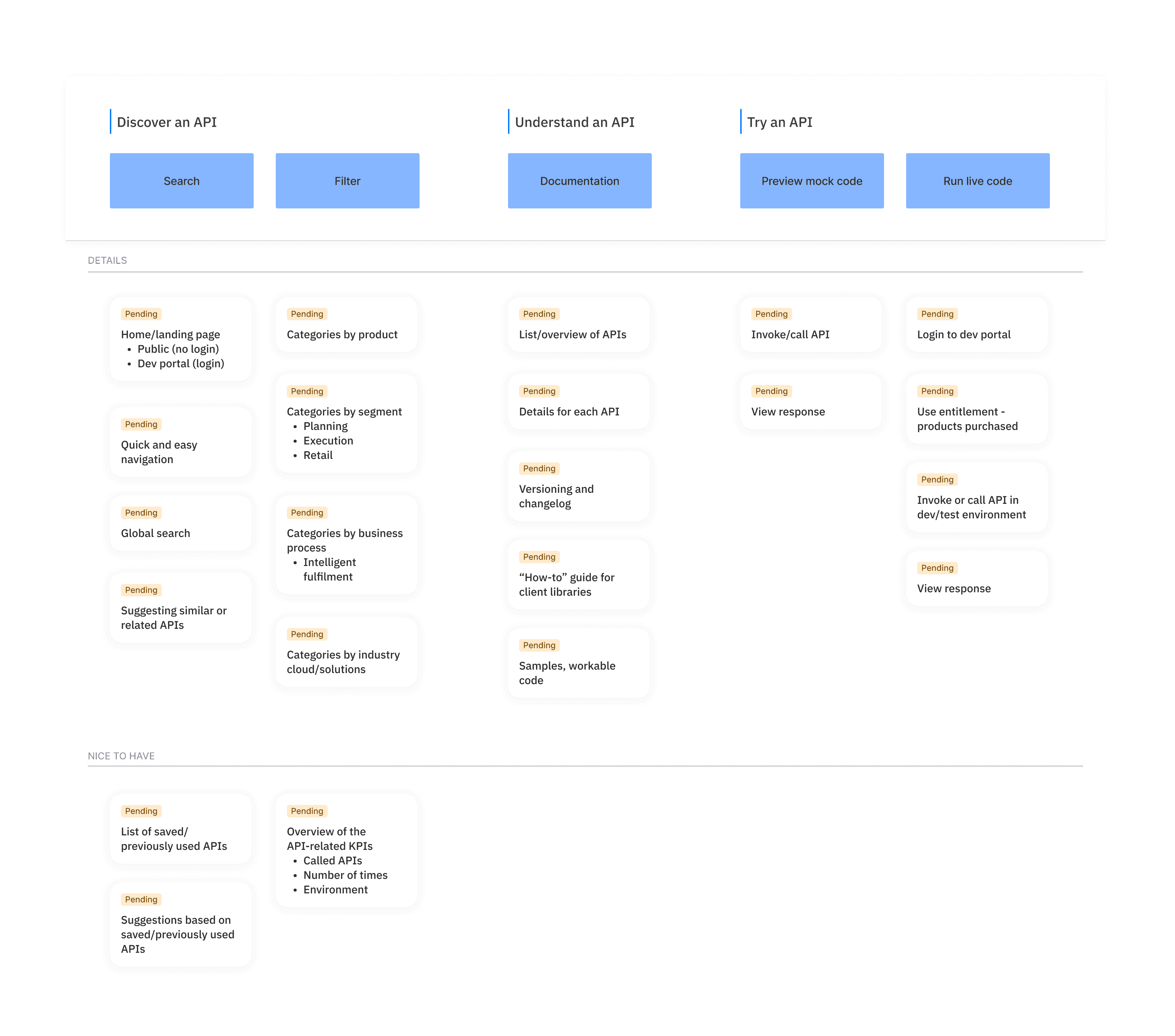
II. USER STORY MAPPING
To align functionality with real user needs, we used user story mapping, a visualization technique rooted in Agile practices. This helped us break down the end-to-end experience, prioritize features based on user value, and identify potential gaps early. By organizing stories around actual user goals, we ensured the catalog not only served business objectives but also delivered meaningful, task-oriented value to its diverse audience.
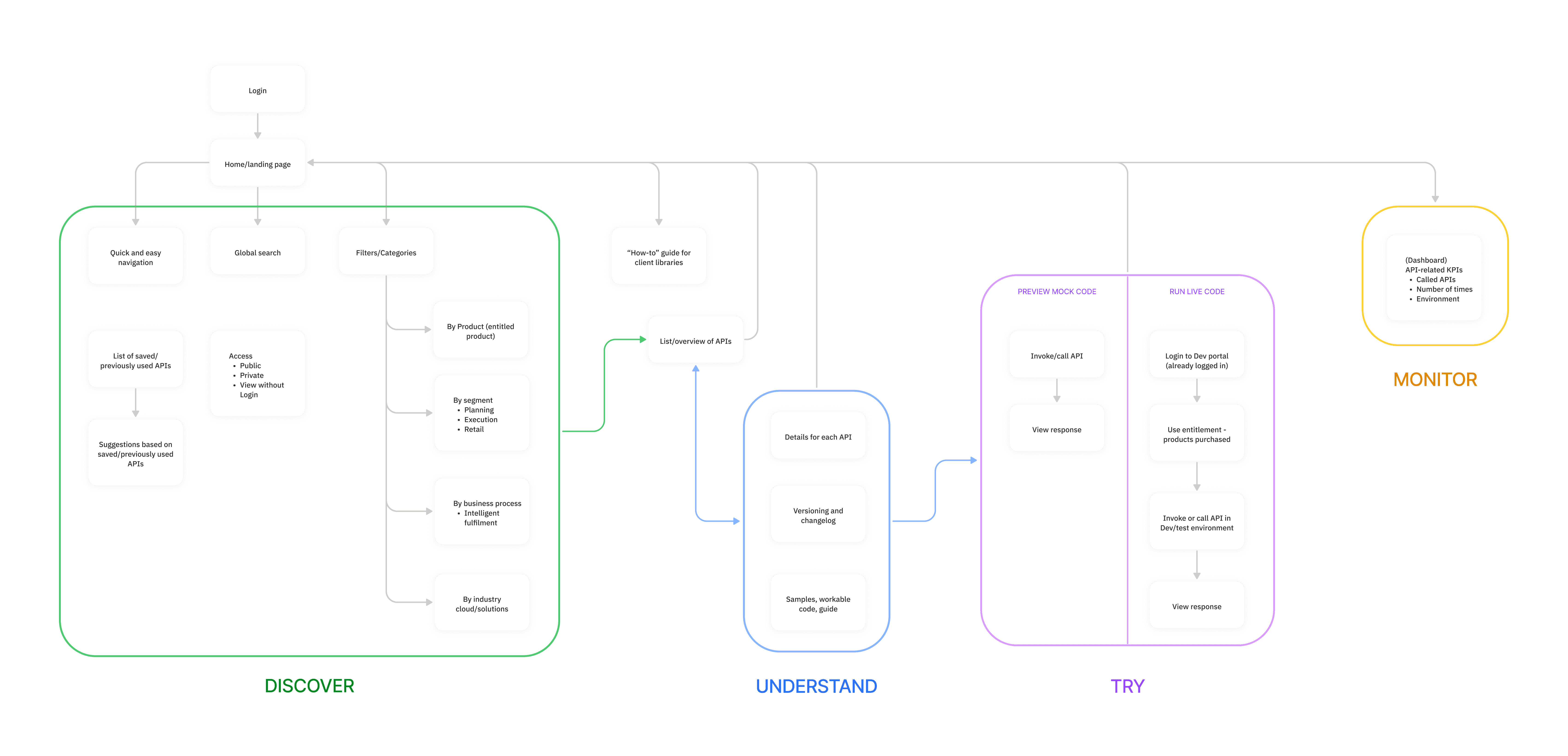
III. INFORMATION ARCHITECTURE
To create a clear and scalable structure for the API catalog, we defined the information architecture with both usability and system integration in mind. This involved reorganizing APIs by category, function, and use case, while setting a consistent hierarchy, labeling system, and entry points across the portal.
A key challenge was seamlessly accommodating Swagger UI content without compromising the design system’s visual and interaction patterns. This meant ensuring Swagger integrations felt native, minimizing friction as users navigated between static pages and embedded technical documentation. A protocol-driven approach to templates and metadata helped reduce cognitive load, maintain consistency, and improve overall scannability.
IV. GUIDING QUESTIONS
To align architecture, content, and design decisions with both user needs and business goals, we anchored the process around a set of core framing questions. These helped guide cross-functional discussions, shape priorities, and keep the user experience at the forefront throughout the project.
How might we facilitate intuitive navigation and discovery of APIs?
How might we uphold the design system’s look and feel while integrating Swagger UI?
How might we foster a consistent documentation protocol and avoid information overload?
V. FINAL DESIGN
The final design delivers clarity, consistency, and usability, enabling users to confidently discover, evaluate, and adopt APIs. From intuitive navigation to interactive documentation, every element was crafted to support a seamless end-to-end experience for both technical and non-technical audiences.
Discover an API
The API Catalog showcases a curated list of APIs, each paired with a concise description to convey its purpose and value. A collapsible left panel enables streamlined discovery through global search, sort, and filter functions, while pagination improves usability by replacing infinite scroll and reducing cognitive load.
Understand & Try an API
A simplified, standardized documentation layout makes it easy for both novice and expert users to understand API functionality at a glance. Integrated Swagger UI allows users to explore endpoints and test calls directly within the portal, supporting faster experimentation and adoption.
LEARNING
Design for Multiple Audiences
Balancing technical depth with usability reinforced the need for layered clarity, surfacing what’s essential while allowing users to dive deeper as needed.
Treat Documentation as UX
Establishing consistent standards, structure, and language across the catalog wasn’t just a content task; it was essential to delivering a usable and scalable experience.
Integrate Without Compromise
Bringing Swagger UI into the ecosystem without breaking the design system proved that third-party tools can feel native when thoughtfully styled and framed.

