OVERVIEW
COMPANY
CORE TEAM


TIMELINE
Sep 2022 - Dec 2023
TOOLS


ROLE
Lead Designer
RESPONSIBILITIES
Product design
Mobile design
Visual design
Interaction design
User research
Product strategy
Legacy modernization
ABOUT EQUINIX
Equinix is a global leader in digital infrastructure, operating 250+ data centers across 55 markets to deliver secure, high-performance colocation and interconnection services. By enabling direct connections between businesses, cloud providers, and networks, Equinix helps organizations accelerate digital transformation, improve efficiency, and scale globally.
PROBLEM
At Equinix, critical tools like Data Center Master, Compliance Certification, and the Emergency Contact List had become outdated and inefficient, creating silos, slowing response times, and driving up maintenance costs.
These legacy systems posed serious challenges:
Obsolete architecture limited scalability and integration.
Inefficient workflows led to high operational burden.
Teams struggled with poor user experience and low adoption.
Lack of centralized access to data center data meant manual intervention and delayed responses to routine pre-sales and post-sales queries.
APPROACH
As Lead Designer, I led the end-to-end discovery and design of the Data Center Knowledge Base, a modern, unified platform that consolidated site-level data and replaced fragmented legacy systems.
The goal was to transform how internal teams access and use information by:
restructuring siloed content into a searchable, scalable, and intuitive experience,
empowering teams to self-serve with confidence and accuracy,
and aligning design with user needs, business priorities, and technical constraints.
This wasn’t just a 0→1 product design, it was a strategic rethinking of how knowledge supports enterprise performance.
IMPACT
CHALLENGE
One of the most formidable challenges in designing the Data Center Knowledge Base was the sheer volume and complexity of data being ingested from multiple legacy systems.
Each source, Data Center Master, Compliance Certification, Emergency Contact List, and others, had evolved independently over time, resulting in:
inconsistent data structures and conflicting naming conventions,
redundant or outdated information that lacked clear ownership,
fragmented metadata with varying degrees of reliability and accuracy,
and dependencies on manual processes for verification and maintenance.
Unifying this information into a single, trusted platform wasn’t just a data migration effort. It required deep collaboration across teams and thoughtful content architecture. It also demanded interaction patterns flexible enough to handle varying levels of completeness while still supporting clarity and confidence in use.
This complexity informed every design decision, from search patterns and filtering logic to progressive disclosure and audit trails.
PROCESS
The mobile-first design philosophy prioritizes creating experiences for small screens first, making it one of the most effective approaches for building responsive, adaptive solutions.
Designing within mobile constraints of limited screen space, bandwidth, and attention span naturally enforces a content-first mindset, helping teams prioritize what matters most.
However, mobile users may have different needs than desktop or tablet users, requiring tailored content or functionality.
Designing for device-specific needs begins with understanding user context, what they value most, when they need it, and in what environment.
For Data Center Knowledge Base, this approach was essential. The product is content-driven by nature, and designing mobile-first ensured an experience that scales gracefully across screen sizes, device types, and orientations without compromising clarity or usability.

II. DATA HIERARCHY
Designing a content-driven experience like Data Center Knowledge Base required more than surfacing data; it demanded clarity, structure, and intuitive navigation from the ground up. With thousands of data points spanning certifications, power capacity, emergency protocols, and site-specific details, Ted, Shagun, and I first focused on establishing a clear, user-centered information hierarchy.
Content was organized to reflect how users scan, group, and interpret information when under time-sensitive conditions.
We prioritized attributes based on frequency of use, criticality to tasks, and user roles, ensuring that the most relevant information surfaced first.
Progressive disclosure allowed us to manage complexity, highlighting key data up front while letting users dive deeper only when necessary.
This hierarchical foundation gave the interface its clarity and made the platform adaptable to future content growth.
III. SEARCH & FILTER DESIGN
With the data hierarchy in place, search and filter design became a powerful enabler rather than a workaround.
We designed smart filters grounded in real user behavior, letting users refine results by location, compliance type, power specs, and more.
Predictive search with clean metadata labels reduced ambiguity and helped users quickly pinpoint the data center data they needed.
Instead of overwhelming users with filters, we introduced them contextually, based on task flow, not technical categories.
Together, structure and search worked in tandem. A well-organized system meant search could be faster, simpler, and more reliable, rather than compensating for disorganized content.
IV. MODULAR INTERFACE
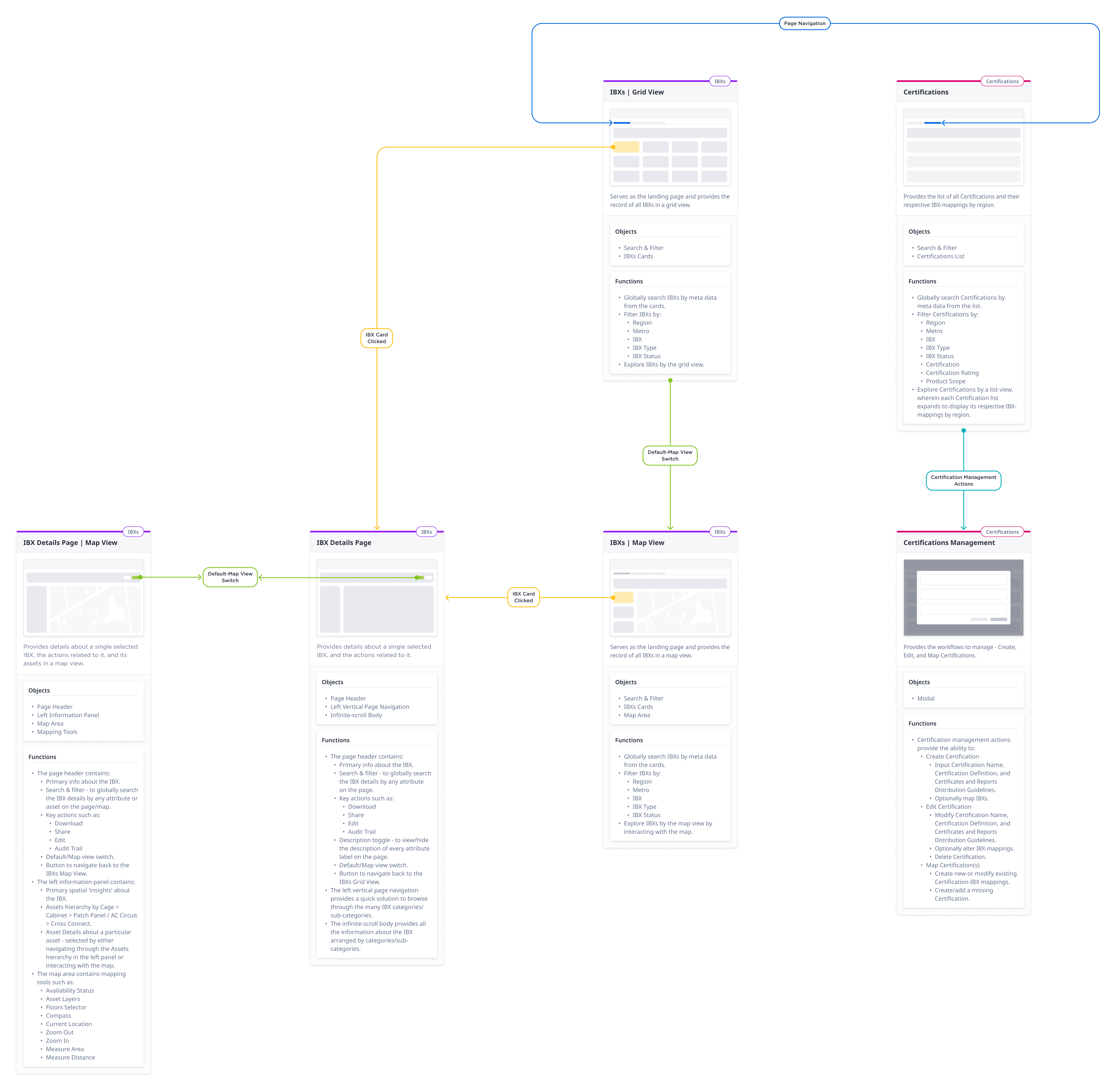
Data Center Knowledge Base was designed as a modular interface, where each core function was structured around independent, self-contained components, each serving a specific purpose, yet working together as part of a unified experience.
Major sections like the Landing Page, Details, Floor Plan, Contacts, and Certifications were treated as distinct modules, each focused on a specific content type or workflow.
Modules could be accessed, updated, or scaled independently, improving both flexibility and maintainability.
This approach allowed the team to prioritize user needs within each module, while ensuring consistency across the platform’s visual language and interaction patterns.
By designing modularly, the system stayed organized and scalable, ready to evolve alongside the needs of the business.
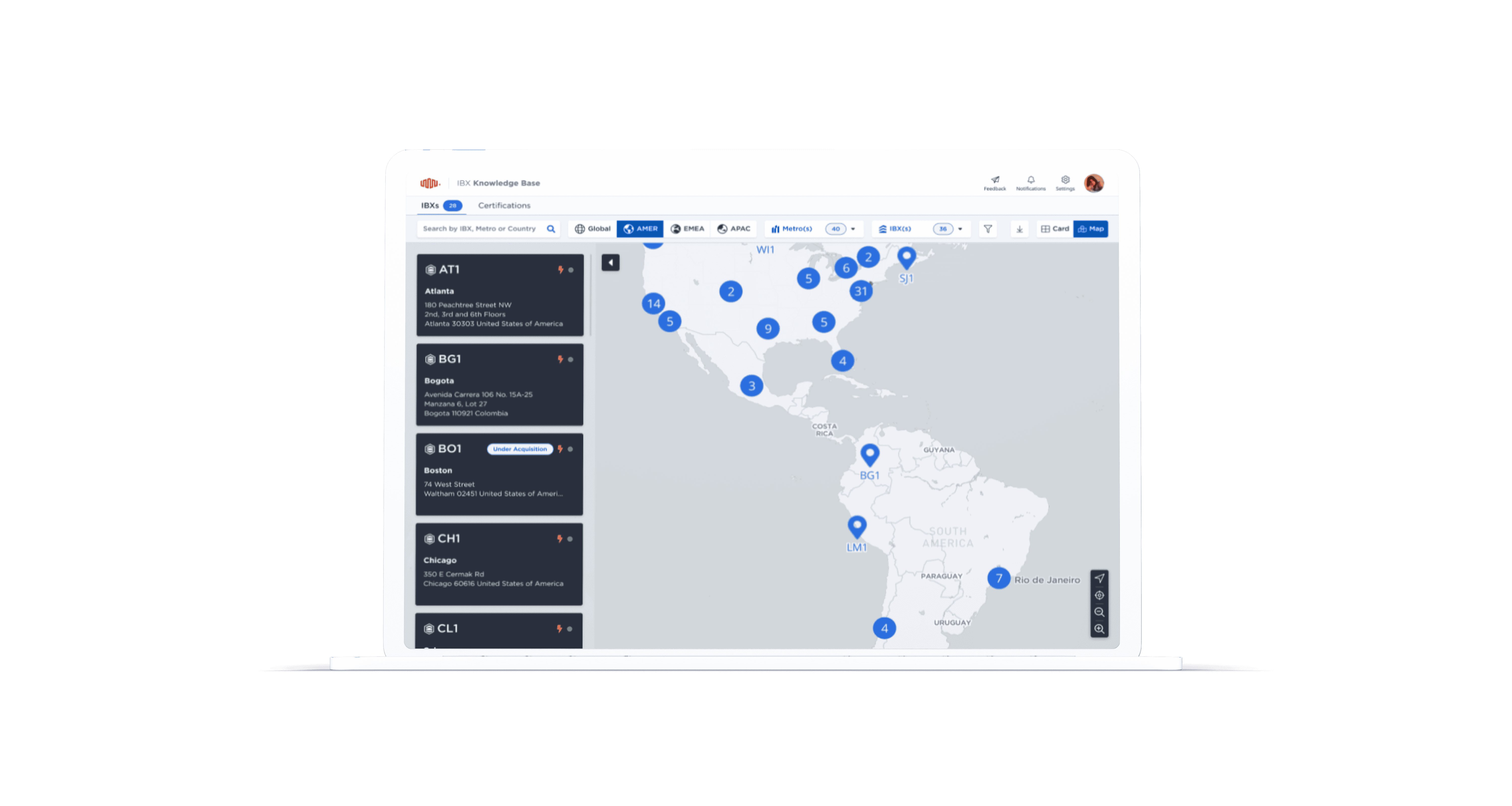
Landing Page
Enabled discovery of data centers through search and filters, surfacing key attributes like Name, Metro, Address, and Status.
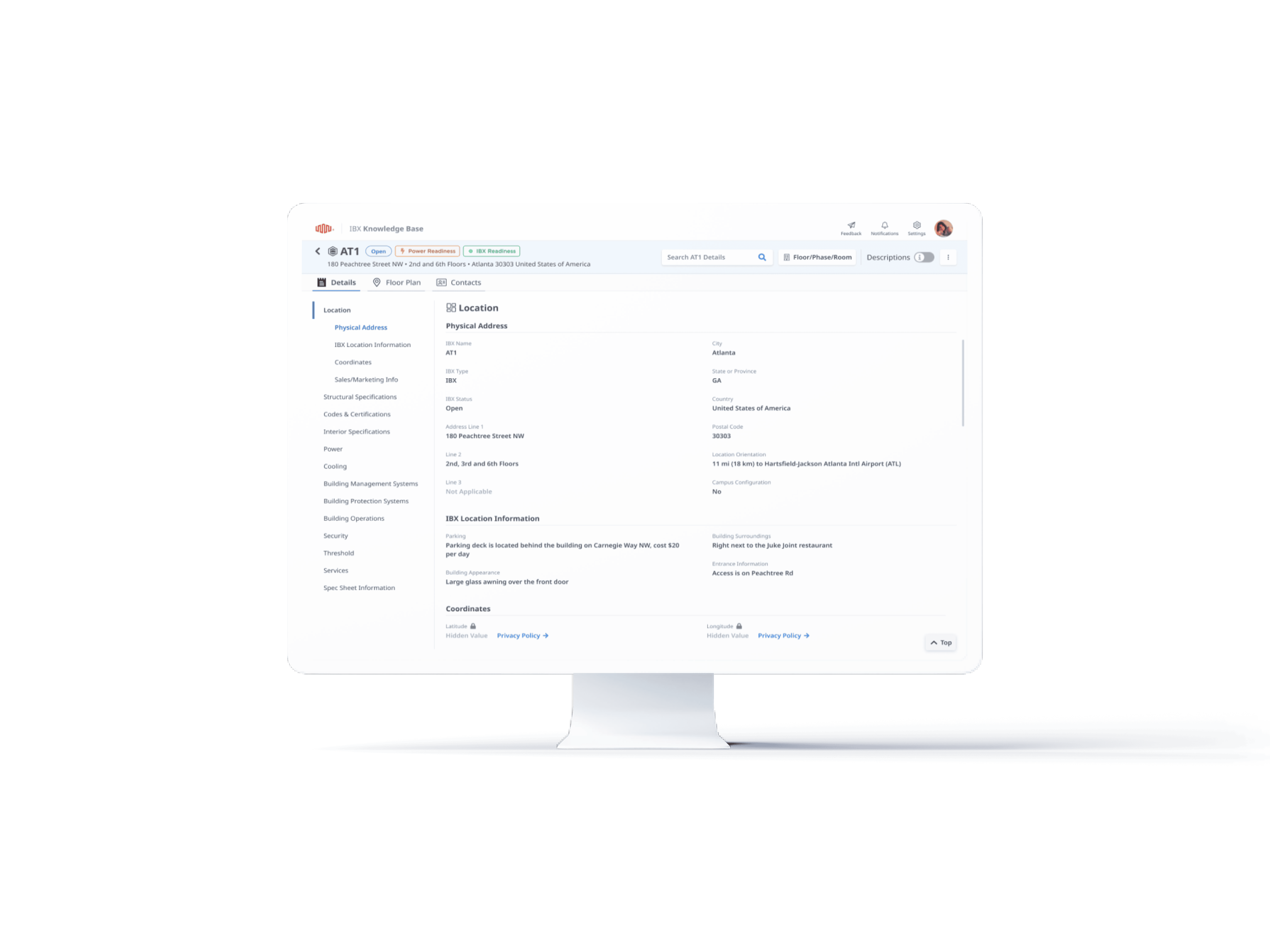
Details Page
Displayed comprehensive site-level data with keyword search and left-hand navigation for easy category-based exploration.

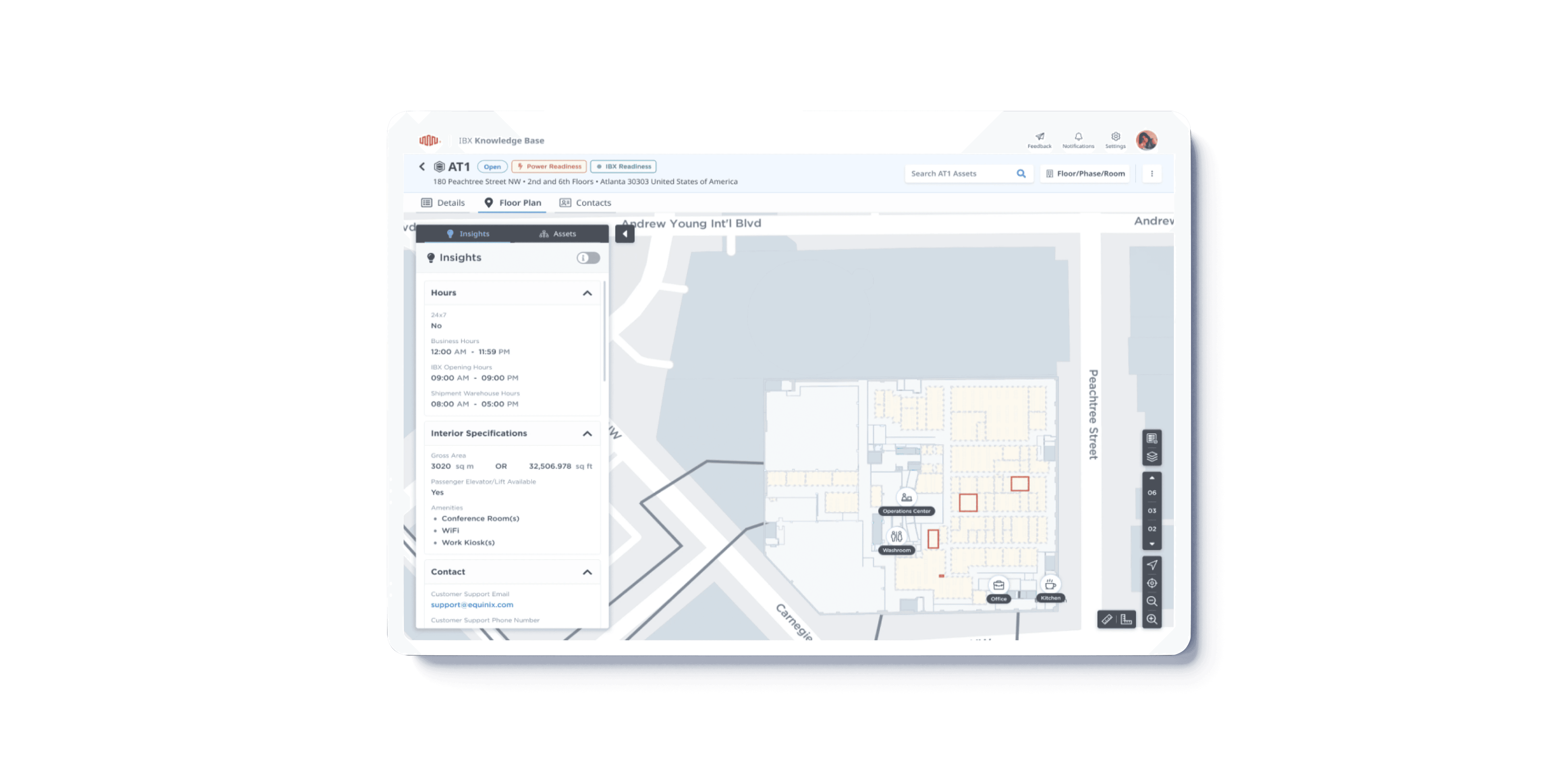
Floor Plan - Map View
Integrated spatial data to let users interactively explore data center layouts, assets, and space restrictions.

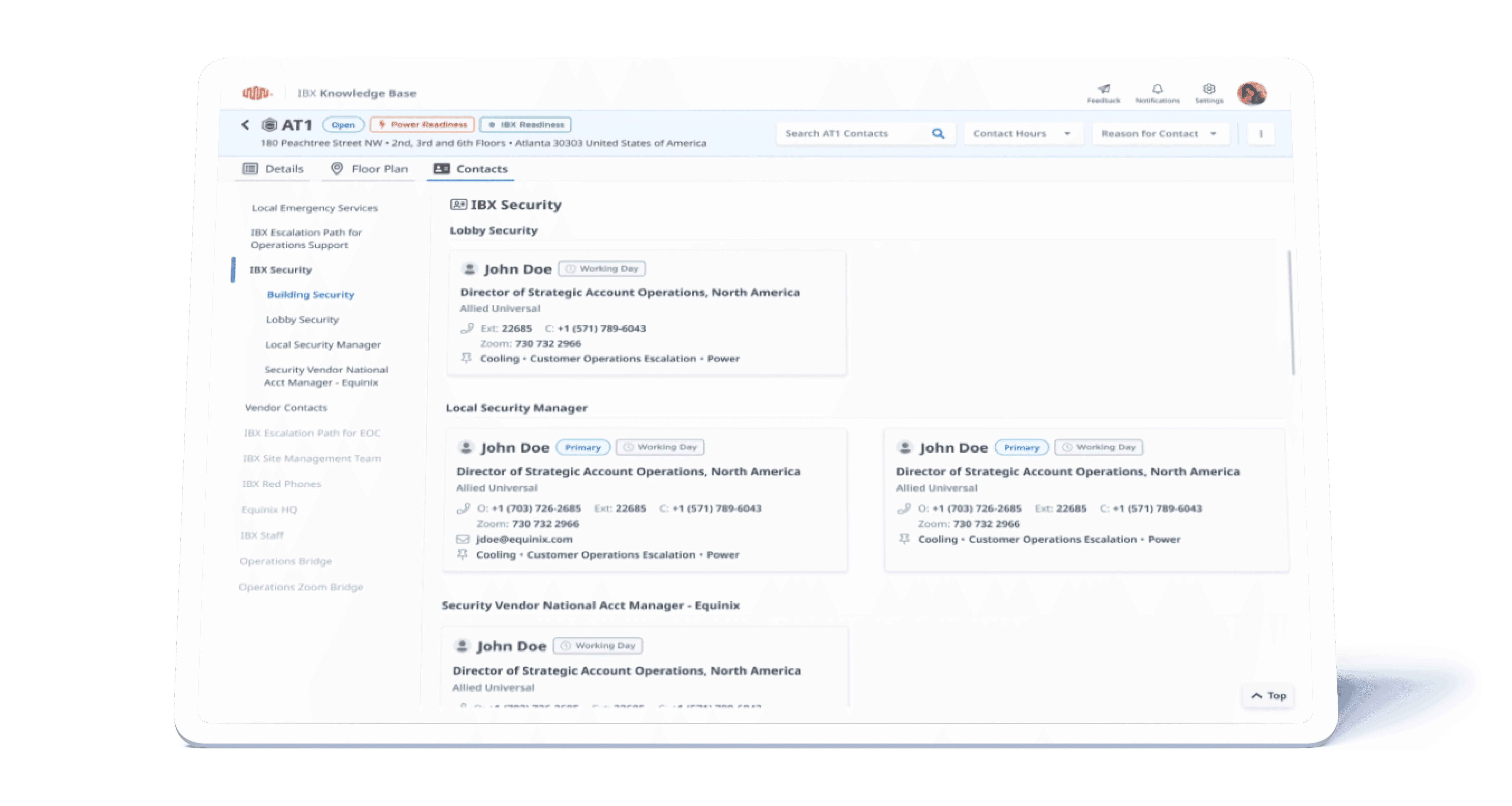
Contacts
Provided tools to view, manage, and download emergency contacts by data center and category.
Certifications
Listed certifications with regional mappings, allowing admins to create, edit, and assign them by data center.

V. INTERACTIVE MAP & SPATIAL DESIGN
As one of the more specialized modules in the Data Center Knowledge Base, the Floor Plan - Map View introduced a new design dimension of spatial data. Unlike static content, this data represented physical infrastructure, requiring the interface to translate real-world complexity into clear, actionable visuals.
Designing for this module involved:
Integrating with EquiMaps, Equinix’s spatial platform, to visualize data center layouts, assets, and space restrictions.
Enabling direct interaction with maps, allowing users to zoom, pan, and click into specific assets or zones for detailed information.
Supporting hierarchical asset visibility, from building-level overviews down to room or asset-level details.
Prioritizing readability and clarity through simplified visual layering, so critical details didn’t get lost in clutter.
Ensuring the experience remained responsive across devices, despite the complexity of the data being rendered.
This module bridged the digital and physical worlds, improving transparency, operational awareness, and confidence for users managing site infrastructure remotely.
LEARNING
Ruthless Prioritization
With so much data and so many stakeholders, success depended on clearly defining what mattered most to users and saying no to anything that diluted focus.
Design = Change Management
Replacing deeply embedded tools meant aligning across teams, building trust, and designing not just for usability, but for adoption and advocacy.
Scalability by Design
From modular architecture to content hierarchy, every design choice shaped how future-proof the platform could be as user needs and data volume grow.